Friendly Mobile Editing Tips
October 25, 2021
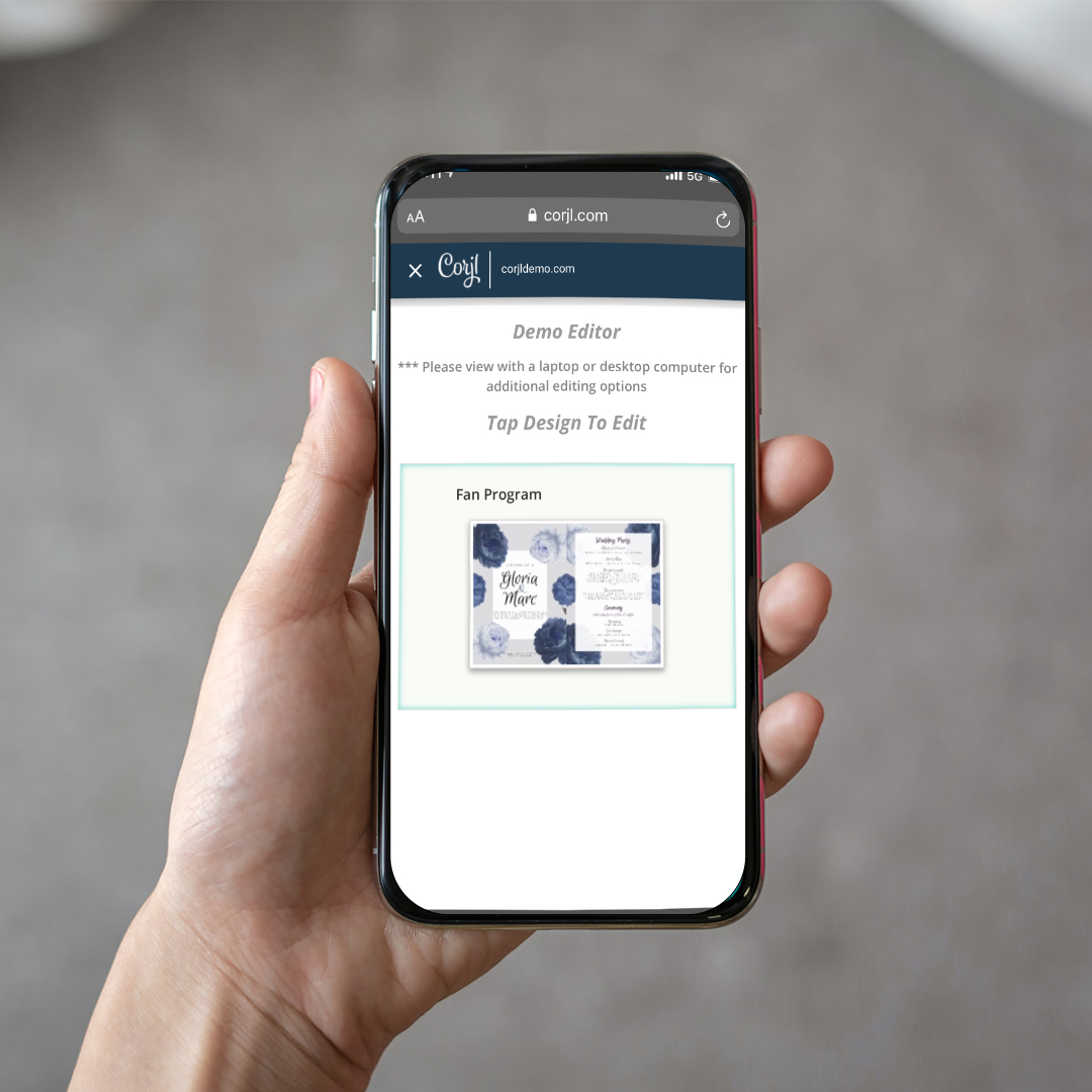
Corjl is not just a desktop editing site, but it also allows you to edit a template on your mobile device. Editing designs on a mobile device can be done quickly and efficiently if you follow these 5 tips to ensure your design is mobile friendly for your customers!
1. Replace Photos
Corjl makes it easy for your customer to simply replace their picture with the placeholder image you created. Replacing photos makes it easy for photo cards, graduation announcements, and brochures as well.
To set this up, you, the designer, will add a photo to your template either by using the clipping mask feature or by dragging and dropping an image on the canvas. When a customer edits the template all they have to do is double tap on the image and a “replace image” pop up will appear on their mobile.
Next – the customer can choose a photo from their camera roll and it will be added to that spot.
Mobile demo test: https://www.corjl.com/d/263BCK
Template Designer: OrangeBlossomPress
2. Simple Text
To make editing on a mobile device user friendly one should stick with simple text. If you are creating an invitation only include all the necessary information and eliminate any unnecessary text. Also- be sure to limit the amount of text in each text box. If a text box has multiple paragraphs of text this will not appear as friendly on a small screen. Editing Tags on mobile are perfect for customers because there are only a few text fields required.
Mobile demo test: https://www.corjl.com/d/25JNAJ
Template Designer: MijaLovesDesigns
3. Lock layers!
Corjl has a unique feature that allows designers to “lock” layers. This means that the customer cannot move that layer, delete it, or edit it. This can be very helpful for when a customer goes to select a text layer on their design they will not accidentally select an image. This makes it much more efficient for mobile users especially if a text layer is over an image layer.
Mobile demo test: https://www.corjl.com/d/D5BP8
Template Designer: DIYPaperless
4. Smart Sizes
Mobile editing is ideal for invitations, announcements, social media icons and digital invitations. It would not be ideal to be editing a large scale photo collage on a mobile phone. If a seller creates a design that is larger than 8×10 inches it can take a longer time for the download to be completed. In case this happens – Corjl has the option to “email the download” so it can be given the proper time to download.
Mobile demo test: https://www.corjl.com/d/14AH9D
Template Designer: EtVieRose
5. Less is sometimes more!
Creating a design that has many layers of artwork can bog down a users’ editing speed. This can cause confusion if they are clicking a text box, but instead the floral artwork is being moved around. Also- it is wise to flatten a background on a design before allowing customer to edit it this also will help with fast editing speeds and download speeds for the customer.
Mobile demo test: https://www.corjl.com/d/6NFANB
Template Designer: ThePumpkinPrintCo
Mobile editing is ideal for quick on-the-go editing. Editing can be done at the beach, in the car or at your child’s soccer match. Create your designs wisely to help ensure editing goes smoothly for both you and your customer.
***Due to screen size full and advanced editing features are only available on a desktop.